The Psychology Behind High-Converting Websites
The Psychology Behind High-Converting Websites High-converting websites do not persuade visitors by accident. They reduce doubt, create clarity, build trust, and make the next step feel logical. For many U.S. businesses, the conversion problem is not only traffic. It is what the visitor thinks, feels, compares, and questions before deciding whether to call, request a […]
The Psychology Behind High-Converting Websites
High-converting websites do not persuade visitors by accident. They reduce doubt, create clarity, build trust, and make the next step feel logical. For many U.S. businesses, the conversion problem is not only traffic. It is what the visitor thinks, feels, compares, and questions before deciding whether to call, request a quote, book a consultation, or leave.
A website can look modern and still fail if it ignores how people actually make decisions. Visitors are not reading every word. They are scanning for relevance, credibility, risk, effort, and confidence. The best websites understand that conversion is a psychology problem before it is a design problem.
Why High-Converting Websites Start With Visitor Certainty
A visitor who feels uncertain usually does not convert. They hesitate, compare more options, open another tab, or return to Google. This is especially true for service businesses, healthcare practices, construction companies, professional firms, SaaS companies, and eCommerce brands where the decision involves money, trust, time, or risk.
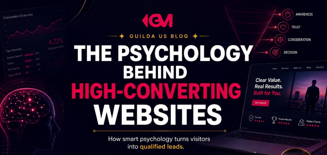
The first job of a conversion-focused website is to answer the visitor’s silent questions quickly:
- Is this business relevant to what I need?
- Can I trust them?
- Do they understand my problem?
- What happens if I take the next step?
- Is this worth my time?
When those answers are missing, even good traffic can turn into weak results. Paid ads become more expensive. SEO brings visitors who do not act. Local rankings generate views without calls. The website becomes a leak in the growth system.
A high-converting website does not pressure visitors. It removes the reasons they hesitate.
The Real Psychology Behind High-Converting Websites
The psychology behind high-converting websites comes down to a simple idea: people convert when the perceived value feels higher than the perceived risk and effort. Every page element either strengthens that equation or weakens it.
A strong website helps the visitor feel three things at the same time:
- Clarity: “I understand what this company does and whether it fits my need.”
- Confidence: “This business looks credible, capable, and professional.”
- Momentum: “The next step is easy and makes sense.”
That is why conversion rate optimization is not just button color, headline testing, or adding more calls to action. It is the process of identifying where interest turns into friction and fixing the experience before the visitor gives up.
What Visitors Decide in the First Few Seconds
Before a visitor studies your offer, they make quick judgments. They look at layout, headline clarity, visual quality, page speed, mobile experience, trust signals, and whether the message matches what they expected when they clicked.
For example, a homeowner searching for a remodeling contractor may compare several companies in minutes. A dental patient may check reviews, insurance information, services, location, and photos before calling. A SaaS buyer may scan positioning, integrations, pricing signals, and proof before requesting a demo.
In each case, the visitor is not only asking, “Do they offer this?” They are asking, “Do I feel safe choosing them?”
The First Impression Checklist
A business owner can quickly diagnose the top of a page by asking:
- Can a visitor understand the offer without scrolling?
- Does the headline speak to a real business or customer problem?
- Is the call to action specific, not vague?
- Are trust signals visible early?
- Does the mobile version feel clean and fast?
- Does the page match the promise from the ad, search result, or Google Business Profile?
If the answer is no, the visitor may never reach the rest of the page, even if the business is a strong fit.
Clarity Converts Because Confusion Feels Expensive
Confusion creates mental effort. Mental effort creates hesitation. Hesitation often leads to abandonment. This is why clear websites tend to outperform websites that try to sound impressive but do not explain the offer well.
A visitor should not have to decode your business. A local service company should make its services, service area, proof, and quote process obvious. An eCommerce store should make product value, shipping expectations, returns, sizing, reviews, and checkout steps easy to understand. A SaaS company should make the product category, use case, audience, and next action clear.
| Weak Website Message | Stronger Conversion Message |
|---|---|
| “Quality solutions for your needs.” | “Roof repair and replacement for homeowners in your service area.” |
| “We help businesses grow.” | “SEO, website, and lead generation strategy for service-based businesses.” |
| “Start today.” | “Request a quote,” “Book a consultation,” or “Schedule a demo.” |
The stronger examples work better because they reduce interpretation. The visitor knows what the business does, who it serves, and what action comes next.
Trust Signals Lower the Perceived Risk of Taking Action
Most visitors are not only looking for the best option. They are trying to avoid making a bad decision. Trust signals help reduce that fear.
For local businesses, trust may come from Google reviews, service area clarity, before and after photos, licenses where relevant, team photos, guarantees where appropriate, and a professional website that feels current. For professional services, trust may come from credentials, process clarity, client fit, case examples, and thoughtful service pages. For eCommerce, trust often depends on reviews, return policies, product photos, shipping clarity, secure checkout cues, and customer support access.
Trust Is Stronger When It Is Specific
Generic trust claims do not carry much weight. Statements like “trusted by many” or “best quality service” are easy to ignore because they do not prove anything.
Specific trust signals are more useful:
- Visible review summaries with context
- Clear service process steps
- Real project photos or product images
- Transparent contact information
- Strong service pages that answer buyer questions
- Relevant certifications, qualifications, or compliance-aware language when applicable
The goal is not to decorate the page with badges. The goal is to help the visitor feel that choosing the business is a reasonable, informed decision.
Why Friction Quietly Kills Website Conversion
Friction is anything that makes the next step harder than it needs to be. It may be a long form, a slow mobile page, unclear pricing expectations, hidden contact information, weak navigation, or a call to action that does not match the visitor’s stage of decision.
Many businesses try to fix conversion by adding more calls to action. That can help only if the visitor already feels ready. If the page has not built enough clarity and trust, more buttons may simply create more noise.
Common Friction Points to Audit
- Forms asking for too much information too early
- No visible phone number on mobile
- Calls to action that say “Submit” instead of explaining the result
- Service pages that describe features but not buyer outcomes
- Product pages with weak photos, unclear shipping, or missing review context
- Landing pages that do not match the ad or search intent
- Slow page speed, especially on mobile
- No explanation of what happens after the visitor contacts the business
A small amount of friction can be useful when it filters out poor-fit leads. But unnecessary friction wastes qualified interest.
The Role of Emotion in High-Converting Websites
Business owners often think website conversion is purely logical. Visitors compare services, prices, features, reviews, and availability. But emotion still plays a major role, even in B2B and professional services decisions.
A visitor may want relief from a frustrating problem, confidence before spending money, speed during an urgent situation, or reassurance that they are choosing a competent provider. Strong website copy speaks to those emotional drivers without becoming exaggerated or manipulative.
For example, a plumbing company does not only sell repair. It sells quick resolution and reduced stress. A therapy practice does not only sell appointments. It creates a sense of safety and clarity, while staying careful with sensitive claims. A SaaS company does not only sell software. It helps a team reduce inefficiency, gain visibility, or make a process easier to manage.
How Search Intent Shapes Website Psychology
A visitor from Google Search often arrives with a different mindset than a visitor from Meta Ads or a referral. Search traffic is usually more intentional. The person is actively looking for a solution, comparison, provider, product, or answer.
That means the page needs to match the search intent behind the click. A local SEO page should help the visitor confirm location, service relevance, proof, and next step. A paid search landing page should stay focused on the campaign promise. A product page should answer purchase hesitation. A SaaS page should connect the problem, product, use case, and conversion path.
When the intent and page experience do not match, visitors feel like they landed in the wrong place. That disconnect can hurt conversions even when the website looks professionally designed.
A Practical Framework for Better Website Conversion
Before redesigning an entire website, business owners should look at conversion through a practical framework. The goal is to find the real bottleneck instead of guessing.
The 5-Part Conversion Psychology Framework
- Relevance: Does the page immediately match what the visitor wants?
- Clarity: Is the offer easy to understand without effort?
- Trust: Does the page prove the business is credible?
- Friction: Is the next step simple and appropriate?
- Follow-up: What happens after the lead, call, form, demo request, or purchase intent?
That last point matters. A website can generate leads, but if follow-up is slow, unclear, or disconnected from the sales pipeline, the business may still feel like marketing is not working.
What Many Businesses Get Wrong About Conversion
A common mistake is treating website conversion as a visual design issue only. A redesign can help, but only if it improves the strategic structure behind the page.
A beautiful website can still underperform if:
- The positioning is unclear
- The offer sounds generic
- The service pages do not match how customers search
- The copy does not address hesitation
- The business has weak reviews or hides proof too low on the page
- The calls to action do not fit the visitor’s decision stage
- The website and paid traffic campaigns are not aligned
This is why conversion strategy should connect SEO, UX, messaging, trust, lead generation, and business positioning. Each part affects the visitor’s decision.
Warning Signs Your Website Is Creating Doubt
If your website gets traffic but does not produce enough calls, quote requests, demo requests, purchases, or qualified leads, look for signs of hidden doubt.
- Visitors leave important pages quickly
- Paid ads generate clicks but few conversions
- Google Business Profile views do not turn into enough calls
- Service pages are thin, vague, or interchangeable
- Contact forms are used less than expected
- Mobile users convert worse than desktop users
- Visitors ask basic questions that the website should answer
- Leads are low quality because the page does not set expectations
These symptoms do not always mean you need more traffic. Sometimes they mean the website is not helping visitors make a confident decision.
How High-Converting Websites Support Better Marketing ROI
A stronger website can improve the efficiency of multiple marketing channels. SEO traffic has a better place to land. Google Ads campaigns waste fewer clicks. Meta Ads visitors get a clearer reason to act. Local SEO and Google Maps visibility become more valuable because the website supports the decision after the profile visit.
This is why website conversion should not be treated as a one-time design project. It is part of the growth system. For a service-based business, that system may include local SEO, service pages, Google Business Profile optimization, reviews, landing pages, call tracking, forms, and CRM follow-up. For an eCommerce business, it may include SEO, product page optimization, paid traffic, email capture, checkout improvements, and retention strategy.
If your business needs help identifying where visitors hesitate, Guilda Marketing can help you evaluate your website, traffic sources, messaging, and conversion path. You can learn more about how Guilda supports service business lead generation with a more strategic digital presence.
FAQ About the Psychology Behind High-Converting Websites
What makes a website high-converting?
A high-converting website clearly explains the offer, builds trust, matches visitor intent, reduces friction, and makes the next step easy. It is not only about design. Messaging, UX, proof, speed, mobile experience, and follow-up all matter.
Why do visitors leave without contacting a business?
Visitors often leave when they feel uncertain. They may not understand the offer, trust the business, see enough proof, find the right service, or feel comfortable with the next step. Sometimes the problem is not interest. It is hesitation.
Does better design always improve conversions?
Better design can help, but only when it improves clarity, trust, and usability. A visually attractive website can still underperform if the strategy, copy, calls to action, and conversion path are weak.
Should a business fix the website before spending more on ads?
Often, yes. If the landing page or website creates confusion, paid traffic may become more expensive and less effective. Fixing conversion issues first can create a stronger foundation for Google Ads, Meta Ads, SEO, and local lead generation.
Your Website Should Make the Decision Easier
The best websites do not force visitors through a sales pitch. They guide people from uncertainty to confidence. They answer real questions, prove credibility, reduce effort, and make the next step feel reasonable.
If your website is getting traffic but not enough qualified leads, the next move is not always more ads, more content, or a full redesign. The smarter move is to find where visitors hesitate and fix the conversion system around that point.
Guilda Marketing helps businesses build stronger digital foundations through SEO, website strategy, lead generation, and conversion-focused marketing. If you want a clearer path from visibility to real opportunities, talk to Guilda Marketing about building a website and growth strategy that supports better decisions from the first click.
Want to apply this to your business?
Tell us about your business and we will review your digital presence, growth stage and the biggest opportunities for your next marketing move.